Overview
Hannaford’s website had not been updated in awhile and the dated designs were not reflective of the modern brand that provided grocery ecommerce.
I was part of a team of 4 designers that worked on the website redesign. My main focuses were the shopping list, content blocks, and addition of online pay and delivery, but I worked closely with the team on all parts of website. After the designs were created, I was in charge of the usability testing.
This project made me much more comfortable working with stakeholders since it involved presenting to the Brand a lot. For every major section designed we would present wire frames > collect feedback > present UI mocks > collect feedback > provide final UI.
Role Senior Experience Designer
Competitive Analysis
UX & UI Design
Usability Testing
Duration 6 Months
Platform Desktop, Tablet, Mobile
Original Website
The original website had not had a design refresh in years. It was full of old patterns and usability issues. It was exciting to build a new experience from the ground up.
Shopping List
Competitor Review
We looked at grocery shopping list experiences as well as best in class list experiences to see what works and doesn’t for an online list making tool.
Shopping List’s can get complex. The best examples practiced restraint on how much information to show and when to show it.
Wireframes
The were a lot components and functions to include in the shopping list. It was a challenge incorporating them while also creating a clean, efficient experience.
Designs
I created designs for the base list and all the functionality that goes with it — adding items to list and cart, removing items, and write-ins, among others. Highlights include a bottom banner that appears after first item check that helps users select, remove, and uncheck items in bulk quickly and desktop hover interactions for certain functionalities to help clean up the UI without compromising on usability.
Check out all the designs here (PW = Hannford).
Content Blocks
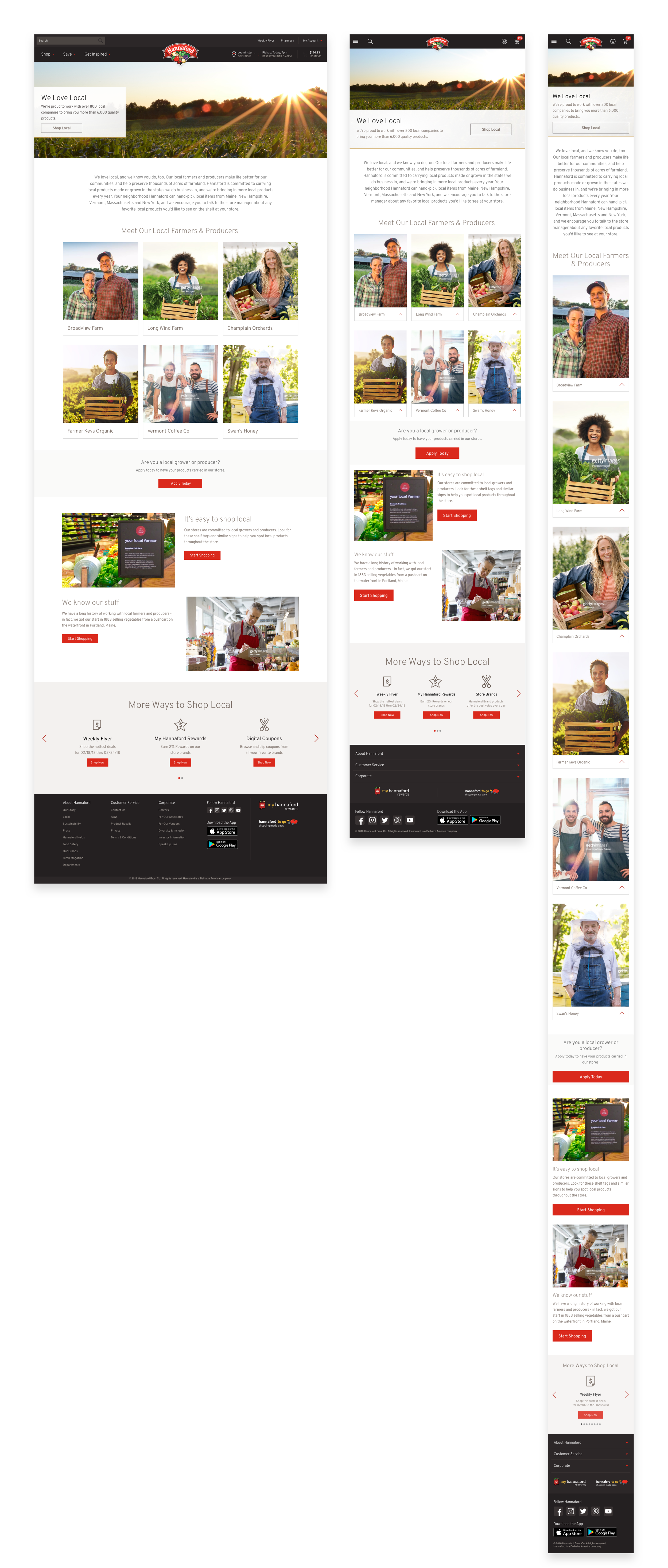
Content blocks were the building blocks of the site. The brand would use these to build pages for the website. As reusable components, they needed to look good on all viewports and look good cohesively together on any given page.
Competitive Analysis
We looked at brands that had well designed content blocks to find inspiration for designs.
Wireframes
Wireframes were used to determine specific image sizes and copy limit for text across the different viewports. This phase was relatively short since seeing the tiles populated with real content gave us a better feel of what worked.
Designs
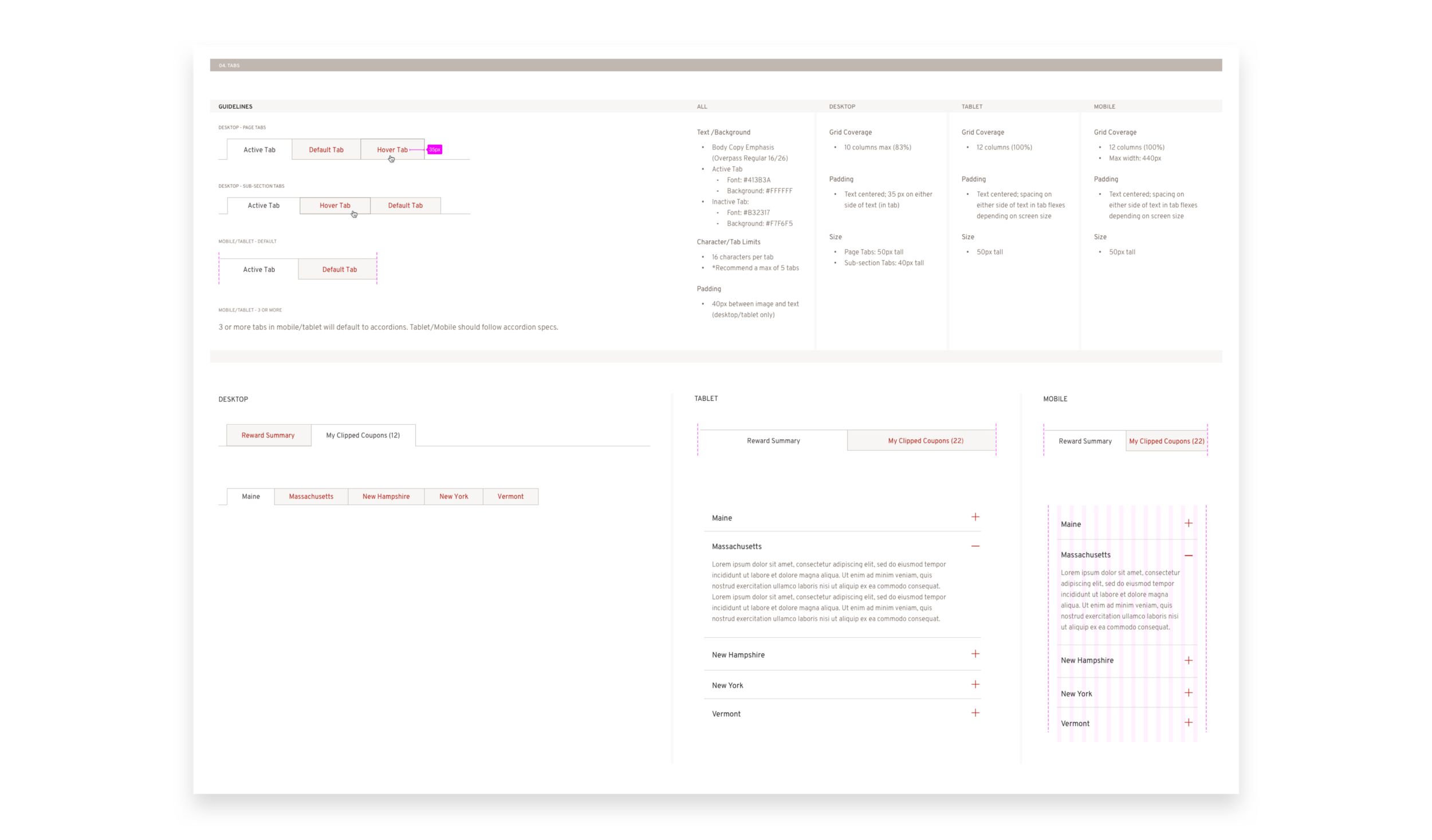
We designed and documented parameters for foundational elements like buttons, tabs, and accordions and a multitude of different image and text combinations.
Check out all the designs here (PW = Hannford).
Online Pay & Delivery
Pick-up was the only option to shop online on the current website. Part of this project was to also build online payment and delivery capabilities to stay competitive.
Competitive Analysis
We looked at how other grocery sites asked for user's shopping method and location. The trend was on first visit, trigger a modal to ask how the user is shopping with option to skip.
Wireframes & Flows
The wire-framing process for this section was mostly site entry flows. There were many paths a user could take during site entry, so thinking in flows helped us edit the number of steps needed.
Designs
This section impacted a lot of areas on the site. I designed and documented the following:
Site Entry
All navigation states
Checkout States
Add payment card
Order History and Details
Check out all the designs here.
Usability Testing
Overview
Once designs were created, I was in charge of usability testing. I created screeners, set up the task list and script, created prototypes, moderated the tests, analyzed the findings, and applied findings to designs.
Set Up
Desktop, mobile web prototypes
22 Hannford customer interviews (11/viewport)
Objectives
Score completion of 19 key tasks
Collect qualitative feedback on overall aesthetic and user interactions.
Collect quantitative feedback on navigation an product tiles.
Usability Scoring System
Each task was scored on a 1 to 5 scale (can’t complete -> completes immediately). If a task scored between a 3-5 it was considered a win although 3’s were looked at for improvement. Anything below a 3 was marked as a usability issue and needed to be addressed before launch.
Findings and Solutions
The Good…
Overall Customers Responded Positively
86% of testers expressed immediate satisfaction with the new website. 82% of the testers felt the new site was easy to navigate.
High Testing Average
Overall average task score was 4.47/5 meaning users were able to complete high profile tasks with ease. Only one task dipped below an average of 3.
“Shopping for items, adding to cart, finding different pages everything was clear”
The Bad…
Bought Before did not resonate with customers as a title name
Scores — Desktop 2.08 | Mobile 3.7 | Average 2.82
We tested the section name Bought Before (aka past purchases) thinking the name would read conversational to customers. In reality, it felt too vague and customers went to Account first to look at past orders.
The solution — Update name to Past Purchases to connect with users mental modal of section.
Mobile Users were not able to check current order status
Scores — Mobile 3.6
When asked to check their order status, mobile users had trouble finding it under account, often going to the menu first. The name ‘My Order History’ felt odd to users since they were trying to check the status of a current order.
The solution — Update name to My Orders to better reflect what a user will find in the section.
The Interesting…
Most users prefer to pick time slot at beginning
In an effort to minimize site entry steps, we were curious if customers picked their order time at the beginning or end. 77% of users said they would pick a time in the beginning since they would have an idea when they wanted to receive the order.
The solution — Keep time slot selector as a step surfaced in site entry with the option to skip
‘Avg Wt’ was more clear to users on product than ‘About’
We were curious for items sold by weight which word choice was clearer to users. 68% of users preferred the label ‘Avg Wt’ because it felt more specific as to how much of an item you would get.
The solution — Move forward with Avg Wt as label used on product tiles.
Takeaways
What I Learned
A million details and decisions go into making a great experience. I really pushed myself to keep refining my designs until only what was necessary was on the screen.
This was the first time I set-up and ran a usability test from start to finish. Running tests take a lot of work and detail, but the outcome is really powerful for yourself as a designer and to use in stakeholder communication.
What I Would Do Differently
Implement a more efficient feedback flow. We worked very closely with the brands and received a lot of feedback that we passed back and forth through an excel spreadsheet. It was a cumbersome task that added a lot of time to the process. I would have used invision to get direct from brands on specific screens.
More user testing while designing. We only did the big usability test at the end due to the tight timeline, but if I went back I would test more often to iterate as we went along.


