Overview
To stay competitive in the fast-paced grocery industry, AUSA brands Stop & Shop, Giant, GIANT, and MARTIN’s decided to absorb the capabilities of their grocery ecom sister company, Peapod . The result would be sunsetting the Peapod brand around these areas and have one Brand website that customers can plan and grocery shop from.
I was part of a team of 4-5 designers that worked on the entire project from planning to strategy to implementation. A true all hands on deck project, I was able to demonstrate my range of Design skills by jumping in at any part of the project that needed work.
Role Senior Experience Designer
Site Transition
Design System
UX & UI Design
Usability Testing
Duration 18 Months
Platform Desktop, Tablet, Mobile
Site Transition
Background
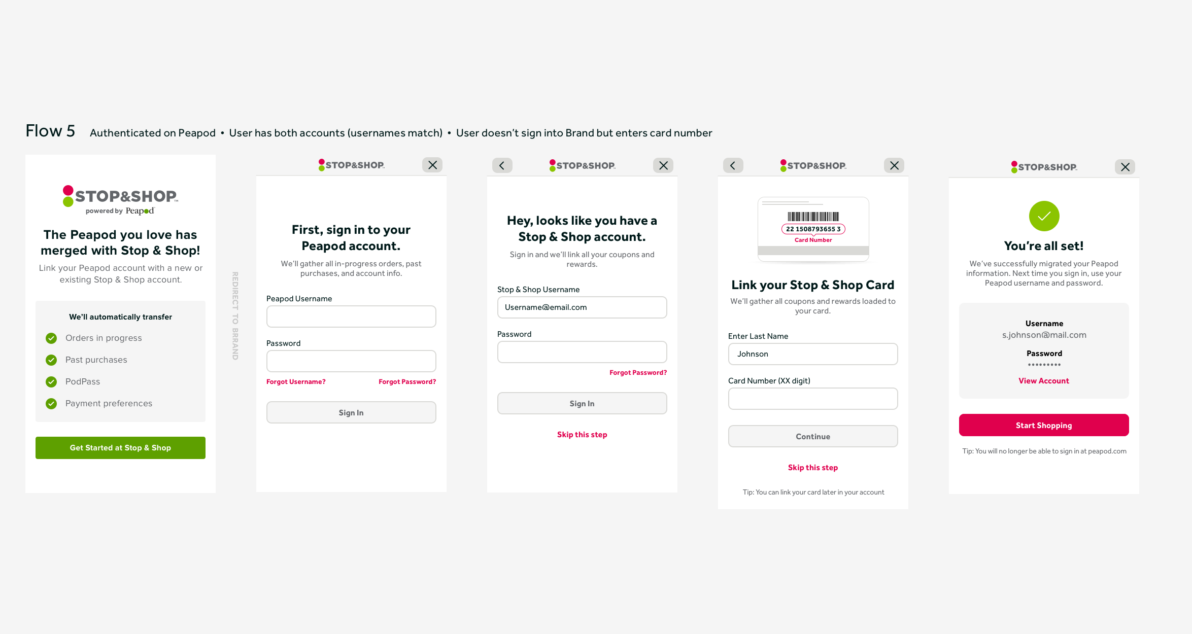
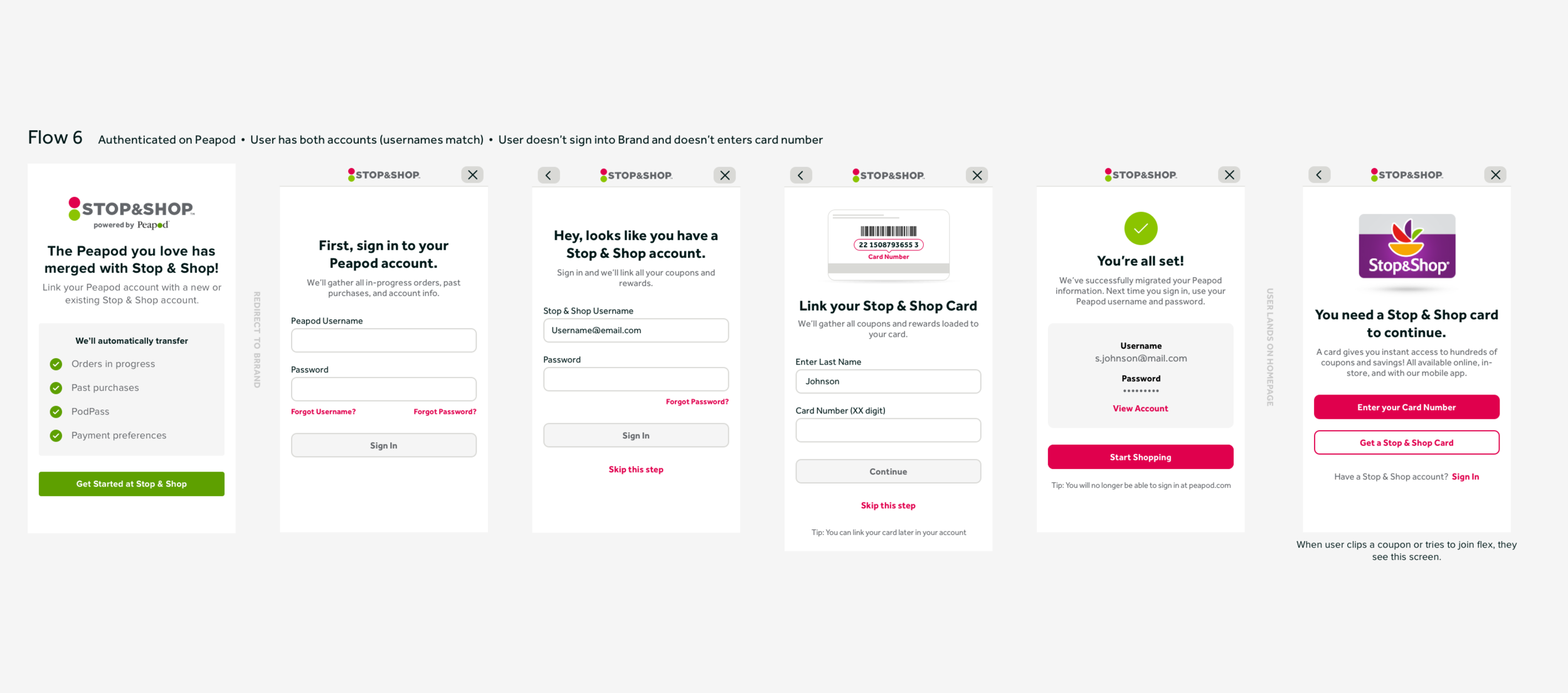
A major part of this project involved thinking of how to transition customers from (potentially) two accounts into one. Peapod’s Account requirements were not 1:1 with Ahold Brand’s. To set up customer’s new merged accounts, we had to sign everyone out of both platforms on day one. When a customer went to Peapod or the Brand’s website, they would sign in and start their site transition flow to get set up on the new website.
This was especially tricky for design because there were 18 different site transition scenarios depending on if customers…
Have a Brand and Peapod Account
Have a Brand Account Only
Have a Peapod Account Only
Have a Neither Account
Have both apps downloaded
Have only one app downloaded
Start from Peapod
Start from Brand
Flows and Designs
Each of the 18 scenarios required carefully crafted copy to guide the user through a stress free transition. It was important to communicate that none of their account information or order history was going away. We were conscious to only ask for information that was absolutely necessary at that time for account set-up (i.e. credit card didn’t need to be entered until checkout).
Designs
Original Websites
Ahold Brands
All four Ahold brand’s had the same website - including styling - the only difference was the logo used and content displayed. Customers went to the site to clip coupons and view the weekly ad as part of their grocery planning routine.
Peapod
Peapod was a sister site to the Ahold Brands that provided grocery delivery and pick-up to customers in those markets.
Project Scope
Peapod’s website would be the design foundation for speed to market.
Navigation would be revisited since we needed to include brand specific pages like coupons and weekly ad.
Brands would have the same website structure and functionality
Brand’s would have unique styling that reflected their Brand look and feel.
Design System
Creating and keeping a design system was a crucial step to ensure design consistency while multiple designers worked on this project. We used sketch libraries and symbols to design and update screens efficiently. We differentiated styling for the Brands through attributes like color, corner radius, and font to make each site look and feel like the brand.
Site Entry
To show accurate products and pricing, we need to know users shopping method and location. Site entry was an initiative to get that information from users without being intrusive to their browsing experience.
The solve was a tooltip that appeared the first time the user came to the site asking which method they are shopping. They can choose to interact with it and provide location information, or they can ignore and continue browsing the Brand’s default store.
Other Designs
In addition to what is shown above, I also contributed designs to the sections listed below. Watch the video for a comprehensive walkthrough of the new Ahold Brand Website experience.
Coupons
Weekly Ad
Shopping List
Product Browse
Cart/Checkout
Store Locator
Usability Testing
Overview
Myself along with a small research team from Ipsos created, ran, and analyzed a usability test on the new designs with Stop & Shop customers before launching MVP.
Set Up
Desktop, mobile web, mobile app prototypes
30 user interviews (10/viewport)
50/50 High vs Low Customer Engagement
Objectives
Examine core navigation and findability of key site elements, focusing on shopping and coupons
Explore how the experience can be enhanced
Compare differences based on engagement and technology use
Compare usability in the redesign versus the current experience
Findings and Solutions
The Good…
Customers had an overall positive reaction to the new website and were able to complete most tasks with ease.
“I was impressed. Overall I did like the whole website; I think it was easy to get around.”
The navigation tested well across all three viewports. Customers were able to find and use coupons and weekly ad and also adapted quickly to the new eCommerce functionality.
…The Bad
Browse in site entry ambiguous
When asked to set up an in-store shopping session, testers guessed browse correctly by process of elimination. The term Browse didn’t feel mutually exclusive to pick-up or delivery, some were conflating Browse with ‘Browse Aisles’.
The solution — Change label to in-store
Favoriting items caused issues
Favorites was Peapod’s equivalent to a shopping list. In testing, adding items to a favorites list took too many steps since it was (1) only accessible from the details page and (2) you had to designate it to a specific list. The term favorites also didn’t resonate with users, the term list was overwhelmingly preferred.
The solution — Change icon and name to shopping list. Remove multiple lists and bring add to list functionality to the tile level.
Redeem Rewards False Bottom (Desktop Only)
When asked to redeem points for a special offer, customers did not realize you could scroll down the page since most computers cut the special offers section out of view.
The solution — Later on we updated the structure of the page to show all the redemption options in one view.
Find Barcode (App Only)
Users were not able to find the barcode they would need to scan in-store to get their coupon and reward discounts. The icon used was not communicating barcode.
The solution — Update icon to better communicate barcode.
Takeaways
What I Learned
Defining and building an MVP - With a tight timeline, I learned how to make decisions on what was a must have for MVP vs what could wait.
High quality customer communication - The site transition flows challenged me to communicate in a concise and informative manner to guide users through an unknown journey.
Get feedback early and often - the quicker you can get ideas in front of people, the quicker they form into baked designs.
What I Would Do Differently
Set up a cloud based design system. At the time of this project Figma was newer and Sketch Cloud did not exist. Using a program that two people could be in the same document at the same time would have been a major time saver.
More user testing while designing. We only did the big usability test at the end due to (1) MVP platform constraints and (2) the steep timeline, but if I went back I would test more often to iterate as we went along.


